INNER VISION
With our five senses, we perceive only the tiniest sliver of the limitless whole of each person and situation. The joy of existence is learning to set aside the limiting perceptions of the ego and to instead use our inner sight to see the limitless, brilliant truth of who we and others really are. These articles are a practice in vision, in seeing as artists see. Seeing this way, without judgment, the world blooms, people bloom.
This truth is reflected in the Sufi mystic and poet Rumi’s words, “You are not a drop in the ocean; you are the entire ocean in a drop” and echoed in the Hindu and Buddhist metaphor of Indra’s Net, which visualizes the world as an infinite net with brilliant clear jewels at each node, each jewel reflecting all the others, creating a limitless web of interdependencies. We are each a reflection of the whole, the entirety of existence, and yet we are each transparent, empty.
LADY OF THE CAMELLIAS
I initially knew Emmy only as one of the friendly baristas at Lê Phin, the lovely little Vietnamese cafe in the East Village that I stop by nearly every day to work, meet people, and enjoy their exquisite pandan matcha lattes and coffees. One moment, the person seated across from me at their communal table is a fellow customer and stranger; the next, I learn he/she/they is an immigration lawyer or a literature professor or an artist, a wellspring of stories and inspiration, and, by the time our cups are empty, a friend. Encouraged by curiosity, they blossom.
So it was with Emmy. She appeared to me in full bloom. Literally. I don’t usually see spiritual visions unless I invite them, but her aura seemed to appear to me of its own accord, lushly framing her with red petals. I thought this must be meaningful, but it wasn’t until I told her this that I learned who she is and why her aura makes sense.
For one thing, Emmy’s Vietnamese name, Trà My Trương, is taken from the Vietnamese word for camellia, cây hoa trà. “Emmy” is a simplified name she chose for Americans, but it still honors her roots. “My” comes from her first name, and “Em” is a sweet Vietnamese term of affection.
ALL MY FAVORITE COLORS
As soon as we started talking, I realized she was intelligent, confident, and mature. She was actually a working artist dedicated to bringing more beauty into the world and chose to work at the cafe occasionally to learn more about the food/hospitality industry. I checked her Instagram and website and found that I loved her artist eye, her color sense, and her approach to life and art. Maybe I simply share her sensibility, but I feel like her slightly muted color palette conveys the subtle complexities of the emotional tones of her subjects, suggesting the passage of time or the way that the strongest feelings lie under the surface and are thus not entirely visible. That nuance is more satisfying than something that is loud and simple, and it induces a sense of nostalgia or longing.
For instance, in her Instagram post above, we see four women reaching into a basket of what looks like fruit. She posted it just over a year ago, but it feels much older due to the muted color. We cannot see their faces, but we can feel their energies are all dynamically focused toward the fruit. The off-reds and pinks of their jacket sleeves direct our eyes toward the off-red fruit in the center. Their proximity creates intimacy. Their hands even touch. And the faded color lends a poignancy to it, as if to emphasize that this was a special moment to be remembered and savored, but is nevertheless fading from view.
In this next group of photos, the first shows a group of people slow dancing along a river bank beneath a bridge, the color is further desaturated, somewhat sepia. The focus is soft, and the sky is overcast but bright, fitting the feeling of slow dancing. Embracing your partner, slowly swaying to the music, eyes soft, the world becomes soft and dreamlike. Loud colors wouldn’t fit.
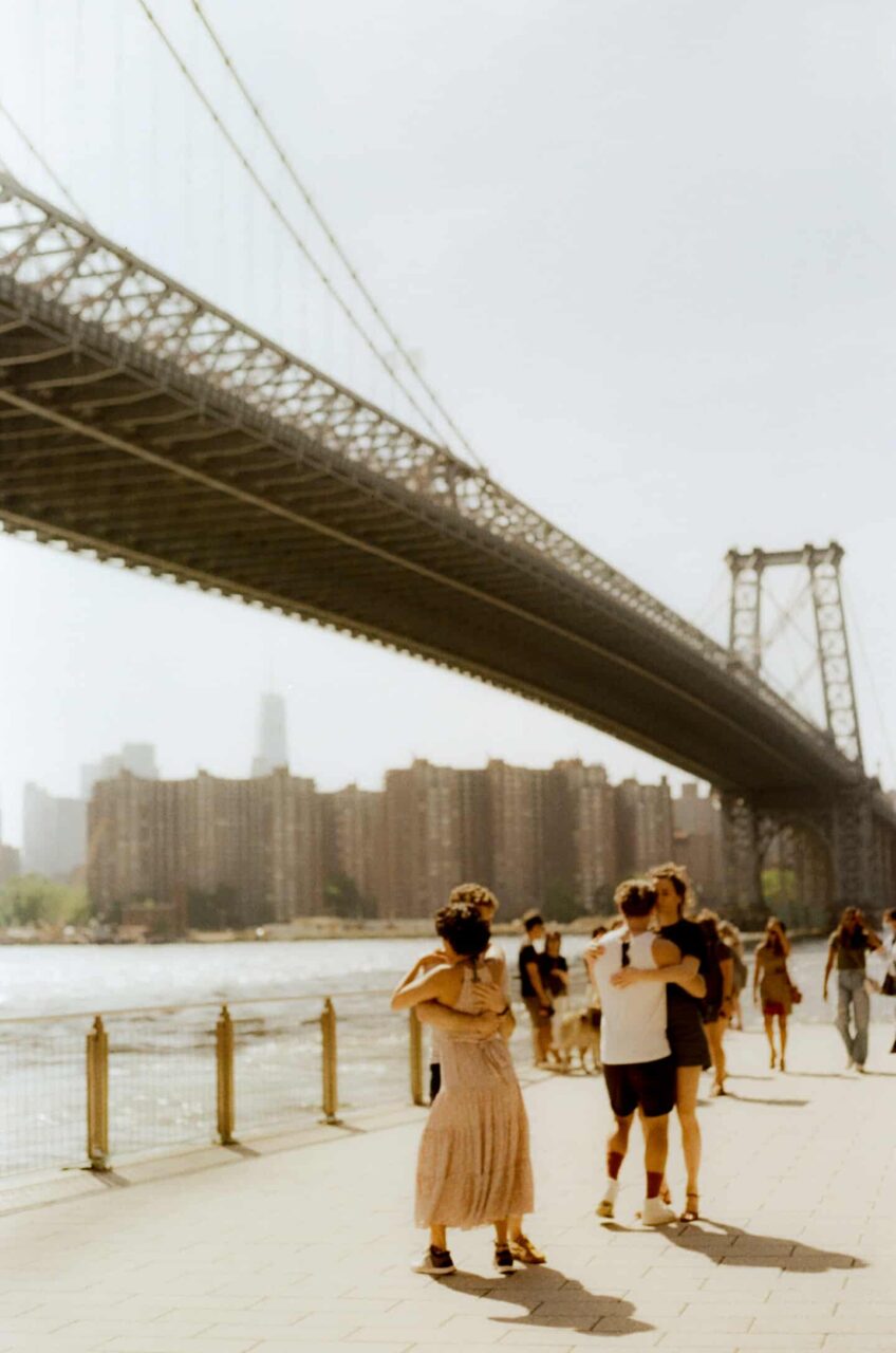 Photo © by Emmy Truong
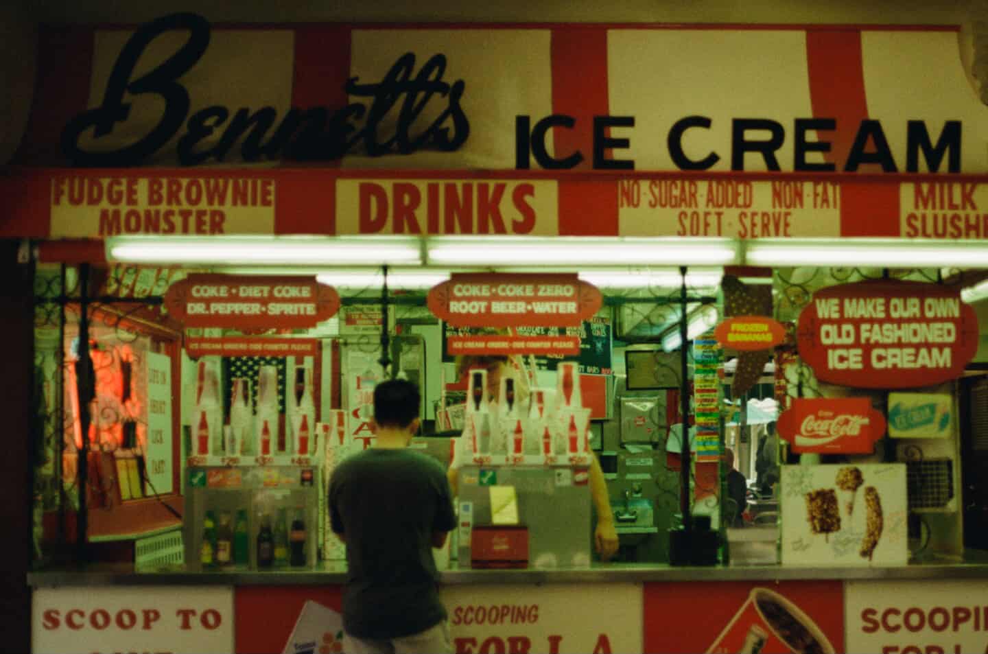 Photo © by Emmy Truong
The second photo in this post shows a man in a solid dark T-shirt standing before a soda fountain. The Coca-Cola reds are muted, much like the reds in the earlier photo of the women reaching into the fruit basket. Even though his clothing is contemporary, the coloring makes it feel like it’s from a time gone by.
In earlier decades, Coca-Cola actually did use more muted reds, partly for practical reasons but also I think because the softer red is more friendly, more indicative of something that has been preserved over time, like a beloved tradition — similar to the way the company benefited tremendously from associating Coca-Cola with the beloved image of Santa Claus in his red suit. James Sommerville, VP of global design at Coca‑Cola, considers it the company’s “second secret formula.”
I asked Emmy how she sees the connection between color and content and if her choices were instinctive.
Yeah. I think that for me, obviously, harsh color would be a crime to anybody who has to see it on screen or wherever the artwork is located. So I try to avoid making something that’s in your face. For me, I think color is very important. I love color. I wear color all the time. But not in a way that’s in your face. I just kind of have it as like a pop of color.
And I think it’s the same sentiment that I have in my work. I want it to be a pop of color that attracts your attention. But it should be enough that it blends with whatever surroundings that it’s supposed to be in. I kind of like to include all the colors in the rainbow, if possible. But not in a way that is contradictory. It’s just that I think it’s fun to look at. It’s kind of like in real life when you look around, there are so many colors around. I want my work to have that parallel with what I see in real life. Just softened in the work that I do. Because that’s how I see the world. And I think we could always use a little bit more color every year.
As I’ve discovered the ways she inspires and brings beauty into the world, my understanding of her and appreciation for her have bloomed. She strives to be, as the Iranian dissident artist Fereydoun Farrokhzad said, “a poet in all moments of life. Being a poet means being a human being.” Emmy herself describes her mission as “to capture and share the abundant joy in everyday moments. Through her art, she seeks to celebrate the human experience and inspire others to find beauty in the world around them.”
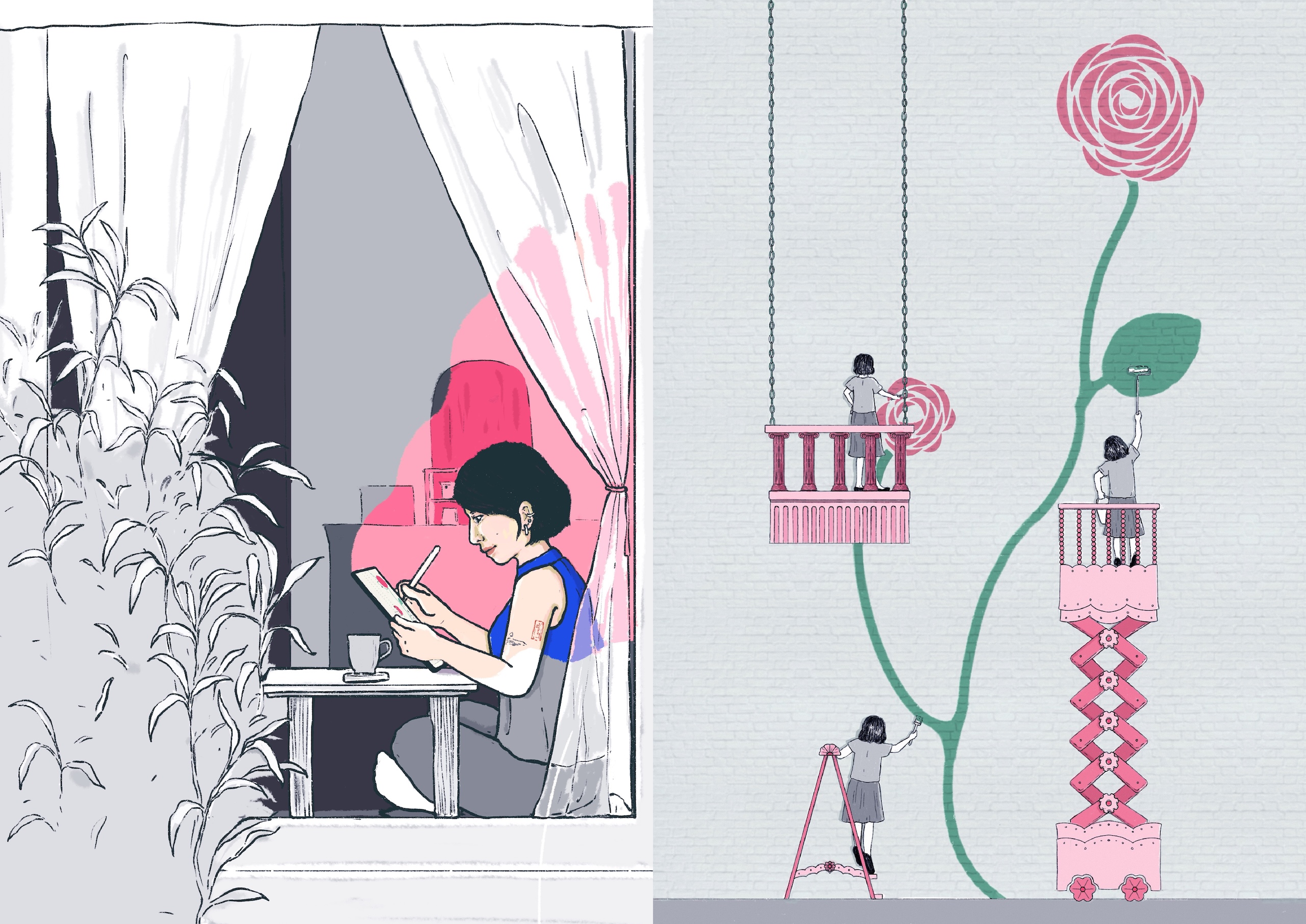
In the two-panel illustration Emmy created for the top of the article, she shows herself drawing in the window seat at Lê Phin. We see her from outside through the window. She is quietly focused on her drawing, not drawing attention to herself, simply another one of the customers. Yet, the window frames her, and she is bathed in a playfully pink light, suggesting that she is in her own world and aglow. While the image is mostly desaturated, she judiciously added pinkish hues to her lips and to a small tattoo on her left arm, as well as to some round shapes on her iPad screen. And then the top of her shirt is a brilliant, complementary blue,, which suggests clarity of thought to me. All of these choices communicate the way she uses her mind to re-imagine her environment, quietly stripping it of chaotic or clashing elements and re-creating it with greater intentionality, aesthetic coherence, and whimsicality.
The second panel depicts what she is drawing on her screen in the first. Repeating the judicious use of pink hues in a mostly desaturated environment, she replaces the blue with green to portray the stem and leaves of a camellia. We can recognize that the round blobs of pink on her screen are camellia blossoms, which reference her name. The camellia is being painted on a large outdoor brick wall by several figures, each resembling the figure in the first panel, the artist herself. She is wearing a different outfit, but the haircut is the same. We do not see the artist’s face, so we focus on her activity. It’s not about what she looks like or what she is feeling but rather about her imagination and work. The fact that there are three images of her suggests her industriousness. It conveys a compression of the passage of time and her fanciful desire to replicate herself so she can work faster and create more. The wheels and hinges of her elevator dolly, and the hinges and top of her ladder, are playfully shaped like flowers, subtly enhancing the sense of whimsicality and beauty, imbuing it with a Dr. Seuss quality. The playfulness of the contents, composition, and color scheme is uplifting and fun and can be enjoyed without thought, but if we do choose to reflect on the choices the artist made, we also realize how much consideration and love inspired every choice. Not a single element detracts from her vision. Together, the two panels portray the artist creating a portrait of herself in the act of re-shaping her environment to reflect the way she imagines it and in a way that may give greater pleasure and inspiration to those who enter into it.
THE ARTIST’S WAY
I think Emmy must have been born into this life with this soul purpose, even if it took her a while to accept it fully. She has been drawing since the age of two. Since their means were limited and they didn’t have much paper, her mother allowed her to draw on the walls of their home. Whatever surface Emmy could touch became her canvas. She had her own way of seeing the world around her and remade it according to her inner vision.
A single parent and doctor, her mother never imagined Emmy might one day pursue art professionally. Nevertheless, she encouraged Emmy to continue exploring her creative interests, signing her up for art camps. When they remodeled their home, her mother preserved Emmy’s drawings on the walls, the closet, and the furniture….
Aside from the occasional art camps, Emmy had no access to formal art education and no memory of visiting galleries or meeting other artists. Living in Hanoi, she was exposed to the many finely wrought craftworks that are widely used and displayed there. Still, while the artistic processes of creating them stimulated her, their traditional style conflicted with her aesthetics. Emmy was always re-imagining the world, but she never imagined art to be her possible future career any more than her mother did. On the contrary, she thought she wanted to follow her mother into medicine. She had to grow into giving herself permission to be fully herself — as we all do.
She said, Initially, she “was going to study in Vietnam for however long it could be. We’re not in that financial situation to dream so big.” Nevertheless, Emmy’s mother thought it would be a good idea for Emmy to complete her high school studies abroad, where she could broaden her horizons and find an environment more suited to her personality and interests. So, she applied for numerous grants and scholarships, thinking she might get an opportunity to study abroad in a nearby country like Singapore, Australia, or Europe. As fate would have it, she received a scholarship to attend her final two years of high school in Virginia.
“It seemed impractical considering our financial situation. But I guess she, being a single mom, is always kind of thinking differently. And she’s always going out of her way to do things that seem impossible for her. So I think she was the one who pushed me to go….”
Following high school, she was able to remain in America to attend her dream school, Denison University, in tiny Granville, Ohio (pop. 5,946). She still intended to follow in her mother’s footsteps and become a doctor. However, the dream soon became a nightmare. She hated the classes.
I was in an environment (small-town America) that kind of deprived you of everything else. You’re limited to only the activities you would have in school. So, my classes were my life. And that was like a glimpse into the future for me. If I can’t stand doing this for a few hours a week —I don’t like graphs, I don’t like charts, I don’t like numbers — I can’t see myself doing it long term. And I’ve always been the type of person who can’t do things I don’t like. So, I just went with what I know and what I feel inside. I’ve always been the type of person. And it’s nobody’s fault. It’s just that you try, you learn, you figure out it’s not for you. And I am the type of person to try out everything before I come to a conclusion.
INNER GUIDANCE
Her best friend from high school had enrolled at the Savannah College of Art and Design (SCAD). Faced with a choice between trying to power her way through an educational track she couldn’t stand or surrendering future job security to commit herself to art, she followed her heart. She joined her friend at SCAD after just one semester.
Try to imagine yourself in her place. You are on your own, far away from your family. America is still new. Being on your own is still new. The first semester of college is, in and of itself, new and overwhelming, and on top of that, you find you hate it. She had a lot of motivation to transfer. Still, it took a lot of guts, energy, and work to apply to and get into another school, qualify for a scholarship, uproot herself again, and transfer to an art school in yet another unfamiliar place. Despite all that, she listened to her inner voice and followed it. She credits her friend for encouraging her.
We went to high school, and then we went to college, and now we’re living together in New York. She’s also an artist on the side, but she does music and production. I’m always looking up to her as a role model for being a self-starter. I think that most people in my life stick to their nine-to-five. But this person happens to take the time and effort and energy to also pursue her passion, which is music, while being able to provide for herself. So, I look up to her as a role model since that day.
That best friend, whose artist persona is Juliet by Night, composes infectious music and witty lyrics that skewer guys and society in equal measure. She delivers them in a world-weary and poised Roxie Hart by way of Anna Mae Wong persona. Continuing to inspire Emmy down new paths, she has cast her in one of her music videos:
Emmy’s commitment to following her inner voice is what made me want to write about her. It seemed like whenever she encountered an obstacle, she would explore her options carefully, try her best, and then follow her heart. Following one’s inner guidance is not a decision one makes once and then lives happily ever after. Life continuously brings us situations that invite us to recognize and let go of our fears and preconceptions. Every moment is a practice in tuning in and choosing again, and every time one follows one’s heart, it provides inspiration for everyone else to do the same.
In Emmy’s case, attending art school was liberating, but it didn’t solve everything. As thrilling as it was to be immersed in a community of creatives for the first time, she was still nervous about whether this path could ever support her financially. She’d started down this road much later than many of her classmates and didn’t know whether she could really ever support herself as a professional artist. “My mentality was still torn between living a comfortable life and following my passion.” So, she studied advertising, preparing herself to employ her artistic skills in the seemingly more secure commercial world.
This led to internships and corporate employment for Emmy. But, after being laid off several times from corporate jobs, she realized that path did not offer her the security she craved, and those jobs did not allow her to use all of herself either. That realization prodded her to follow her inner guidance once again and escape that world to go into business for herself.
Since then, she has been putting her skills to work freelancing for food industry clients she chooses, like Lê Phin, where we first met. She’s doing what she wants to do with people and organizations with whom she wants to work, organizations promoting authenticity, craftsmanship, community, sustainability, and minority and female voices. She says on her website profile that she has learned to use her practical design skills and fine arts influence “to help people I care deeply for in my communities tell their stories through impactful visual means.”
And it’s supporting her financially, which is what we all want. Now she understands: “If you are passionate about something, don’t ever consider it a second option. Just go for it with your whole heart and soul. Sometimes, bad experiences actually lead to open doors for better things to come. With hard work and a bit of faith, things will always work out.”
CATCHING THE BIG FISH
Even though she’s thrilled to be working with restaurants and other community organizations, she appreciates the time she spent studying and working on various larger corporate advertising and design campaigns because that’s how she learned to use her creativity to serve a larger purpose, a client’s goals, or the community good.
I think that’s the stepping point from being a hobby-based artist to a professional artist. It’s that you’re separating yourself from the art. It’s still your thinking. But now, if you’re lucky enough to work with a client, then you’re basically taking what they’re saying and translating that into your own style.
Much of her creative work for clients is disarmingly charming. It’s friendly and draws you in — pun intended — and makes you feel welcome, like her world and the client’s world is your world, too. Since most of her clients now are in the food and hospitality market, this approach is ideal. But her work is conceptually sophisticated, too. Whether she is designing menus, signage, or social media campaigns, or painting murals, her work integrates her style and fine arts influences with the clients’ style and also expresses the character and values of the client in a way that makes them immediately recognizable and attractive.
This reflects one of her fundamental beliefs about art, that it should be accessible to everyone. “Instead of elevating it to something untouchable, why not make it part of everyday life? My goal as an artist, designer, and maker is to bridge this gap, integrating art into the ordinary and bringing it closer to people through every piece I create,” making the world bloom.
So, even in her commercial and collaborative work, she is endeavoring to create beauty and to express big ideas conceptually. She is creating art. Back when she was still in Atlanta, she elaborated on this in a profile on https://voyageatl.com:
With culture, storytelling, and wellbeing as the pillars of my works, I seek to create design solutions that don’t just look good but also must solve problems and make our lives a bit easier.
As I have mentioned before, a big idea always comes with values, stories, and insights. These are ideas that stick around, they have the ability to reach people while also contributing to something bigger than us all. But a big idea doesn’t just come in the blink of an eye; it takes a while for Creatives like us to do our research, experiment, and even hundreds of trials to come up with one plausible idea.
Anyone who watched “Mad Men” should find this resonates. Who can forget the way Don Draper dreamed up his ideas, none more brilliant than his season one finale pitch for the then brand-new Kodak Carousel slide projector, whose value derived from its ability to invoke nostalgia?
Nostalgia. It’s delicate but potent. Teddy told me that in Greek, ‘nostalgia’ literally means ‘the pain from an old wound.’ It’s a twinge in your heart far more powerful than memory alone. This device isn’t a spaceship. It’s a time machine. It goes backwards and forwards. It takes us to a place where we ache to go again. It’s not called the wheel, it’s called the carousel. It lets us travel the way a child travels. Around and around and back home again, to a place where we know we are loved.
— Don Draper
Filmmaker and visual artist David Lynch puts it this way:
Ideas are like fish. If you want to catch little fish, you can stay in the shallow water. But if you want to catch the big fish, you’ve got to go deeper. Down deep, the fish are more powerful and more pure. They’re huge and abstract. And they’re beautiful.
Everything, anything that is a thing, comes up from the deepest level. Modern physics calls that level the Unified Field. The more your consciousness — your awareness — is expanded, the deeper you go toward this source, and the bigger fish you can catch.
Desire for an idea is like bait. When you’re fishing, you have to have patience. You bait your hook, and you wait. The desire is the bait that those fish in — those ideas.
The beautiful thing is that when you catch one fish that you love, even if it’s a little fish — a fragment of an idea — that fish will draw in another fish, and they’ll hook onto it. Then you’re on your way. Soon there are more and more and more fragments, and the whole thing emerges. But it starts with desire.
— David Lynch, Catching the Big Fish: Meditation, Consciousness, and Creativity
Emmy’s process follows this to a T. Guided by her desire and curiosity, she learns everything she can about her subject and then patiently waits, watching her mind for the big ideas to surface. She elaborates that it’s “rooted in storytelling, starting each project by identifying a compelling anecdote.” She asks her clients lots of questions, trying to get to know them well, fishing for those meaningful anecdotes. This sounds like my process, too! She continued:
I kind of let go of my ego and focus more on what kind of work I want to produce for the person I’m working with. I think that’s the paradigm, or shifting the focus from me to just making something as is. And then I kind of let the other person [the client] share as much as they want. And usually people already kind of tell you what they want from the get go. Like they already have an idea of what they want, but what they lack is the ability to visualize it and the ability to make it or figure out the suitable way.
Because how I work is that my style draws inspiration from very little things in life. Everything that is sentimental tends to be very personal and people wouldn’t share it. Like, well, people wouldn’t just immediately be able to tell me, “Oh, I want you to draw this for me. I want you to draw that for me.” But they will kind of like leave me breadcrumbs throughout our conversation.
Wow, I identify a lot with this. Only, I’m very sure I couldn’t have thought this way or articulated this in my 20s. She shared an example with me:
The restaurant that I did the mural for [Bánh Vietnamese Shop House], the first project that we worked on together took us the longest time. But what stood out to me was when first meeting her, she seemed rather reserved. She seemed like she would be into something else. But after talking to her, after hearing her backstory, I was able to identify things that light her up.
When you’re talking about something and you’re passionate about it, it shows. And those are the little points that I’m going to take note of. And then I’m going to try and see if it works. If they like it, all right, going in the right direction. And then we keep going and we keep going. And I think that’s when I learned how to become more of an artist, a commercial artist.
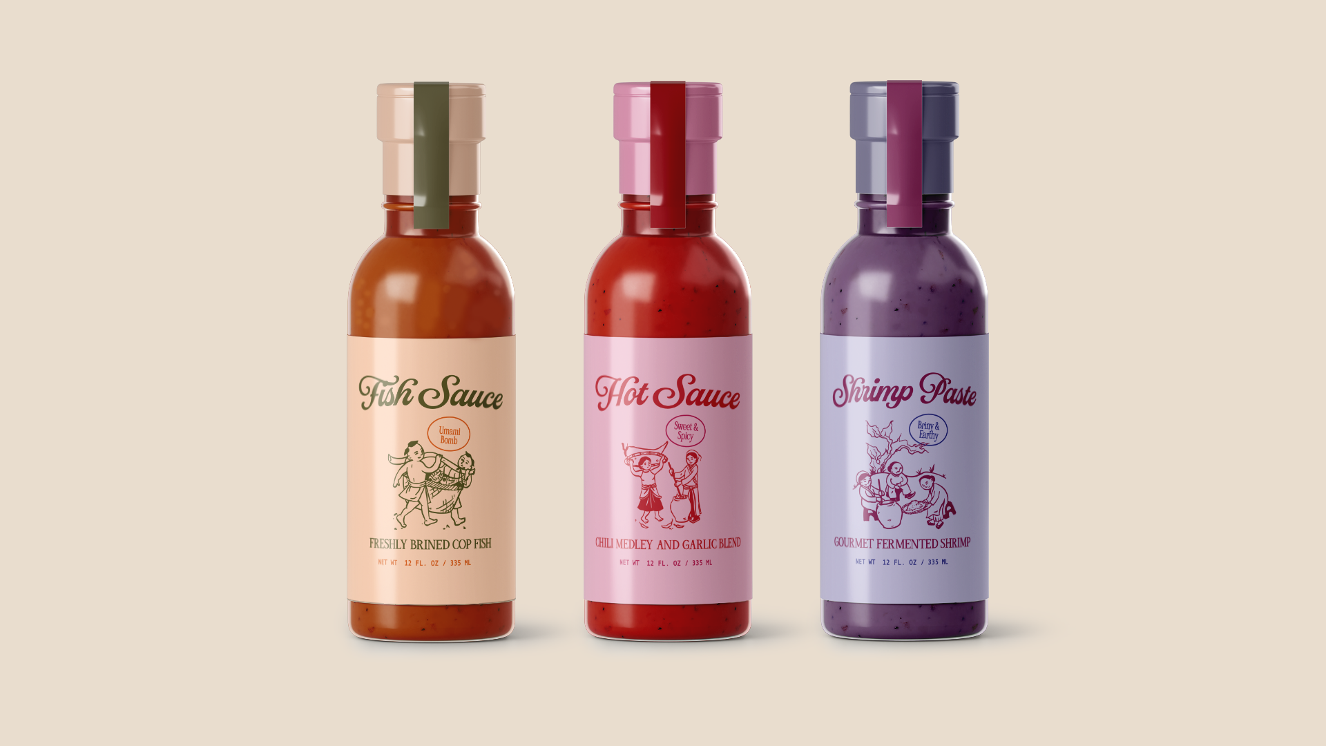
Emmy then brings these stories to life through mood boards, research, and sketching, drawing inspiration from various sources, including fine art and philosophy. For Bánh Vietnamese Shop House, she created a series of condiment labels and complementary signage. “I used my own hand-drawn illustration and scripted type to convey a sense of artisanal since all the products would be hand-made with traditional methods. The use of vibrant pastels allows the products to pop, without overpowering the goodness inside each bottle.”
The restaurant owner asked her to paint a mural for their new restaurant, Bánh Anh Em, but they contacted her only a month before their grand opening. They asked her to fill a long wall space, but didn’t know what they wanted her to depict.
They were just like, make it casual. Make it Vietnamese, but make it fitting as a New York restaurant. And knowing their style, knowing what they’re into, I kind of just drafted a lot of iterations. Like Vietnamese food, restaurants, ingredients. And then I realized that the restaurant is on a street where there are a lot of different restaurants. And I thought it was just so interesting because only in New York can you find so many different cuisines in the same area. You have Korean, Chinese, pie, Vietnamese, Mexican, all sorts of things. And so the inspiration came from the physical location, where you are surrounded by so many ethnicities, but you still stand out on your own.
So, she thought of creating a mural depicting the diverse tapestry of cultures on the block, but they decided that it was too literal, and it would be impossible to paint within three to four weeks. There would be too many details.
Given their deadline, she would paint the mural on just one section of the entryway wall. Sitting down across from it, she imagined the mural as a window pane looking out onto the street. Suddenly, it came to her. Rather than attempt to reproduce the entire block in that limited area, she would paint a window onto the wall and the view through it!
But what view? They wanted something that was not too literal yet evoked the traditional Vietnamese food culture to which the restaurant was devoted yet fit their cosmopolitan NYC neighborhood. Inspiration struck her again. She would create a through-the window view of Bánh Anh Em not as it actually looks but in a more abstract and cartoonish form to give it a more friendly and accessible appeal.
And she would place it in a loft floating in outer space. What?! Exploring a new culture is at times like entering another world. Placing the restaurant in space is a fun way to encourage new customers to experience their visit to the restaurant as a voyage to a different but welcoming culinary and cultural destination.
To further invite diners in, she painted a stepladder ascending to it. Diners could daydream of stepping through the window into this other world and climbing the ladder to join the crowd in this imaginary extension of the restaurant.
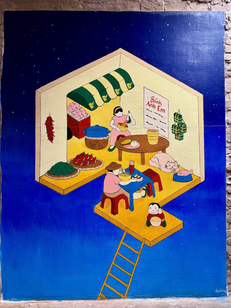 Photo © by Trà My “Emmy” Truong
When I saw it, I immediately loved the cheerful color palette, the clarity of composition, and its playfulness. The colors are mostly bright, except for the paler pinks and light yellow, but they are not quite primary colors either. The palette is cheerful yet tasteful and cohesive. The mustard yellows remind me of the yellows that are prominent at Lê Phin, and the shade of red in the stools, fruits, fish freezer, child’s outfit, tomato slices, and lettering evoke the reds that I see in Emmy’s Hanoi street photography. By using just a handful of contrasting but complementary colors — these yellows and reds, as well as greens and pinks (as well as a bit of black for the hair and outlining) — Emmy ties the various elements together while also making them pop out. That, along with the economy of shading and lack of shadowing, makes it easy for the viewer to identify each object quickly. Even though we are in a restaurant serving food new to NYC — and it’s set in outer space — it feels familiar and welcoming. The smiling child and the cat sleeping beside the cute fish make it even more inviting. By making the interior appear so friendly, she is de-exoticizing it, reminding us that even if the destination is distant and the flavors unfamiliar, the people are still people. We will still be among friends.
As I took in the mural, I realized I was having an imaginative and reflective experience of my own. I wondered if many of the restaurant’s customers had similar experiences while looking at the mural. Emmy had transformed Bánh Anh Em into a place where one cannot only eat delicious food that one cannot find elsewhere in Manhattan but also where one can be inspired to reflect on the experience as journey and encounter.
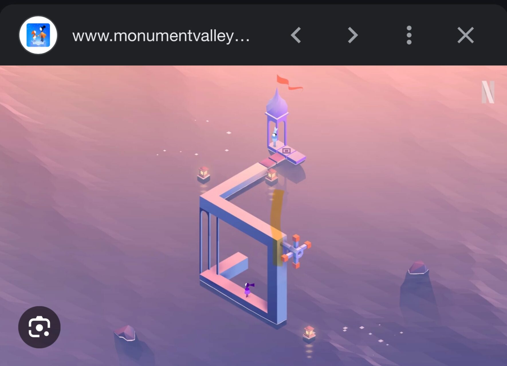
Emmy took further inspiration for the mural’s composition from a surprising source, a mobile video game she’s been playing for several years called Monument Valley.
You basically move these like blocks or parts of the composition. You’re creating a pathway for the character to move from one point to another. There are really no rules for how you play. Obviously, there’s only one way you can get to the destination, but at the same time, you’re not given any instructions. You can go at your own pace. And it’s very soothing. It’s very calming. I just really like it. And I was inspired to do a lot of work just based on the style.
Many thoughts, images, memories, and ideas bounce around inside our minds. Unlike left-brain thinking, which consciously analyzes what we are consciously thinking of based on what we already know, our imaginations quietly entertain multiple seemingly unrelated thoughts, conscious and unconscious, playfully suggesting new associations and thereby bringing new meanings, relationships, and ideas into consciousness.
Even though there would seem to be no relationship between playing Monument Valley and eating in a traditional Vietnamese restaurant, Emmy’s imagination intuitively recognized that the relaxing experience of playing the game, where you not only choose but create your own path and pace, corresponds to the feeling you often have exploring a vibrant neighborhood and its many offerings. Many people traverse the street outside, but each of us explores its many restaurants and their menus according to our own fancy. So the experience has elements that are both shared and unique, public and private.
Moreover, the compositional design cues that Emmy took from Monument Valley support the mural’s fun and welcoming character, encouraging visitors to relax and embark on an adventure into perhaps unfamiliar cultural terrain where they can try new dishes with new friends. So, while the mural may initially appear simple, it has a strong conceptual foundation, and its form and function are in harmony. It serves its intended purpose.
Actually, Emmy’s earlier design for The Golden Planning Guide cover also drew inspiration from Monument Valley, but the Guide says that it was another vision on her daily commute that gave her the initial idea: “while standing on a higher-level platform at the train station, she recognized how similar the people walking on the street below looked to a still cut from a video game.” Why, you ask? The Planning Guide profiles various AAPI-owned businesses across industries and across the country. The cover needs to somehow visually communicate the breadth of the contents as well as what unites them. When Emmy stood on a subway platform and looked down on the people on the platform below, she realized that a cross-sectional view of a multi-level building connected by staircases would allow her to visually place the disparate businesses included in the Guide together in a way that makes sense, as if they exist as neighbors in a shopping mall. By making the structure more abstract, she lets us know that this is conceptual, not literal. The businesses portrayed are, similarly, to be taken as being representative. They are connected within a larger geographical community by their shared AAPI heritage and by a desire to connect, as evidenced by the social activities — dining, dancing, playing, bathing, etc — depicted.

The Guide says, “The cover blends playful illustrations with deeper cultural themes and hope. The use of gold and the abundant food symbolizes a vision of collaborative and collective prosperity.” I would call it Dr. Seuss-esque, captivatingly quirky and charming, but definitely in Emmy’s style. It might seem like a cartoonish illustration is not so difficult to draw, but this took a lot of work.
We see all of these levels from the vantage point of someone above and to the left, looking down and out, and she chose to draw everything with proper perspective. And many subtle and playful details are chosen to convey the particular character or features of each included business, such as the mahjong tiles, the daruma with one eye filled in, and the enormous chopsticks and bowl of noodle soup that dwarfs the people. And again, the fact that so many of the activities shown in the design are social says, “Join the community and get it on the fun!”
Emmy undertakes each project with this degree of care, creativity, and thoughtfulness. By listening deeply to her clients and for the spark of inspiration that arises in her mind, she allows herself to explore, iterate, and distill a design that is true to her clients’ spirit and goals as well as to her own. She finds and brings into form the vision that unites them, a vision that is new to the world yet somehow recognizable because it captures some relatable inner truth. That is not only the essence of art but the essence of community building. So it’s no surprise that art and community building align for her.
What enables her to do this is her curiosity, her love of working with others, her commitment to identifying those unifying visions, and her trust in her ability to get out of her own way and catch those “big fish.”It’s why her clients embrace her and why I am inspired and excited to witness all the beautiful visions she will undoubtedly birth in the future. Uniting form and function, incorporating sustainable materials and a concern for the environment where possible, bringing an authentic warmth, playfulness, charm, and beauty to everything she does, Trá My “Emmy” Truong is a busy bee bringing the world into bloom.
You can peruse more of Emmy’s portfolio and inquire about hiring her here
You can follow Juliet by Night here
You can find my favorite cafe, Lê Phin, here